Beyond the Spreadsheet: The Case for Digital Budget Impact Models and Value Tools
Budget impact models and value communication tools have been part of global and local market access for years, but how they’re delivered can make all the difference. While Excel®-based models remain a staple, digital solutions offer a more interactive, intuitive, and engaging experience for payers and field teams.
To explore what sets digital tools apart, we asked some Petauri Evidence experts from our Local Market Access, Health Economics, Design, and Developer teams to share their perspectives on why digital delivery matters and how it changes the conversation.
Jump to:
- The Local Market Access Perspective
- The Health Economist’s Perspective
- The Designer’s Perspective
- The Developer’s Perspective
- Discover our Digital Market Access Solutions
Explore our Demo Centre, packed with a selection of market access and payer communication tools.
The Local Market Access Perspective

Turning first to Hannah Palin (Director – Local Market Access) and Iain Shield (Associate Director – Local Market Access), to hear their thoughts:
What do you see as the biggest advantage of delivering budget impact models as digital tools rather than in Excel?
Iain: This is a great question. I would encourage a dialogue with a client to understand the situation, and offer pros and cons of both approaches. In general terms, you could think about a digital tool as having fewer constraints, meaning clients’ requests can be met precisely.
Ultimately, the objective of these models is to demonstrate the value of an intervention to payers to drive uptake. A digital approach that combines effective channels with impactful communication can increase the likelihood of getting in front of decision-makers and delivering messages that resonate with them. It can mean being able to communicate a particular piece of your value story that would otherwise be hard to convey, or being able to deliver real-time or latest available data.
Practically though, user experience, usage statistics, central administration, and custom visuals are just some advantages of going digital. This approach delivers a best-in-class communication tool.
How do you ensure that the messaging in these tools resonates with local payer priorities and decision drivers?
Hannah: This is where our many years of experience and collaborative approach puts us at an advantage. By working with you to analyse usage data (where available), leveraging insights from your field teams on the ground, and drawing on our partner networks, we can ensure the messaging will work for all your internal and external audiences. This integrated approach allows us to optimise both the user experience and align with audience priorities from the very earliest stages of development.
What’s the biggest advantage of integrating economic evidence with a clear communication flow in one tool?
Hannah: There are many advantages, but most commonly our clients wish to combine approaches in order to:
-
- Ensure consistency in how value is presented across materials, discussions, and field teams, irrespective of context
- Maximise return on investment by consolidating multiple solutions into a single asset and supporting broader adoption
- Clearly demonstrate how clinical, economic, and system value interplay in a format that even allows payers to adapt data to reflect their real-world scenario
How do these tools support compliance while still allowing flexibility for tailored discussions?
Hannah: For compliance, digital offers some really practical options. Content can either be pre-defined or adaptable, depending on your compliance needs. A classic example would be navigation features or access features that have to be ‘acknowledged’ via active participation (for example, a tick box or acceptance button). Whilst flexibility can be facilitated by changing the presentation mode (i.e. carousel of content versus page by page; as seen in our Value Proposition Slide Builder demo), specific criteria can be set ahead of the meeting based on the stakeholder’s profile, ensuring that only the approved content appropriate for them is included.

Integration with Customer Relationship Management (CRM) systems can further support this balance. With CRMs, and tools like our Global Value Platform, colleagues can be given access to only the relevant materials and evidence. Features like this can ensure that affiliate field teams only have access to the tools they have been appropriately trained to present or to the evidence relevant to their market.
What’s one feature in our digital tools that you think makes a real difference in how the story is told or understood?
Iain: The overall professionalism of the tool aids its delivery. Without the constraints of Office software, ‘pixel perfect’ branding is possible. There’s more time to engage a customer, and less time waiting for a laptop to open the right version of an Excel document. The ‘at your fingertips’ nature of digital keeps things moving.

What feedback have you received from users that reinforces the value of digital tools?
Iain: We receive positive feedback regularly, but some of the feedback from digital tools is truly “stand out”. Delivering visually engaging insights on large datasets over a quick and easy-to-use iPad tool is hard to deliver another way. Our clients recognise this, as do the field teams using the tools.
The Health Economist’s Perspective

Some of these tools combine a value proposition with a budget impact or cost-effectiveness model. Such models are built in Excel first by our expert Health Economists, who then work with our Design and Developer teams to transform them into interactive apps. Whilst Excel models can be used in the field, there are many advantages to a digital tool. Next, we come to Manish Chauhan (Associate Director – Health Economics):
What do you see as the biggest advantage of delivering budget impact models as digital tools rather than in Excel?
Manish: Great question! For me, a few things really stand out:
- Better user experience – In an almost gamified way, users can interact with the tools through drop-downs, pinch-zooms, and finger-swipes, just like they would on any other tablet app. It feels intuitive and engaging without being over the top

- More flexibility with visuals – Digital tools allow animations for presentations and the integration of rich media, such as videos, making the experience more dynamic and visually appealing
- Simpler tracking and reporting – It’s easier to record when field teams engage with healthcare practitioners (HCPs) and when reports from the tool are shared with customers, giving you better visibility and insights
What challenges do you see in translating complex health economic evidence into a format that field teams can confidently use?
Manish: We understand the challenges of translating health economic evidence into a digital tool. We simplify complex models into key concepts that we can communicate quickly. This is one of our core competencies, and we support our clients throughout this process. We lead our clients through simplification, layering ‘nice-to-have’ features, handling data, visualising concepts, and gaining stakeholder consensus. These are areas where we have in-depth experience and truly enjoy guiding them.
If health economic models can be developed in Excel, they can be translated into a digital tool. The skill here is the ability to replicate the evidence with rigour and accuracy using an alternative mathematical engine. We recognise that many end users, as well as the audience, do not have a technical health economist background. Thus, we must challenge ourselves to translate the complex into relatable, real-world solutions.
What features in these demos help ensure that local assumptions and scenarios are accurately reflected?
Manish: The starting point for most models is based on a set of publicly available data sources. These are valid assumptions but often made at a national or macro level. So having the ability to amend national assumptions with local knowledge is important because they can translate into model results, which are more relevant to a sub-national perspective.
Our digital tools are set up with national assumptions as a default, and users have the ability to amend these assumptions with their values throughout the models. Where it is possible to include data from a range of sources or regions, we can build tools that enable the user to choose their preferred option. These tools then dynamically update the references to reflect the choice, thus maintaining transparency by showing where all information has been sourced.

How do digital tools improve the way economic evidence is communicated compared with Excel models?
Manish: The look and feel of a digital tool can offer a best-in-class user experience when communicating the narrative. Excel can be deemed as “just a spreadsheet” but whilst its technical rigour is well established, it is limited in its visuals and ability to animate messaging. A digital tool can incorporate many designs and innovative ways to communicate key messages, as I’m sure my colleague, Ryan, an expert designer, will expand on.
The Designer’s Perspective

Design plays a key role in bringing these tools to life. Ryan Booth (Principal Designer) explains how:
What do you see as the biggest advantage of delivering budget impact models as digital tools rather than in Excel?
Ryan: Delivering budget impact models as digital tools offers a level of clarity, precision, and usability that Excel simply can’t match. Unlike spreadsheets, digital tools allow us to design every interaction deliberately, guiding users through the data in a way that feels intuitive and effortless in a much more immersive environment. Every element, from layout and hierarchy to interactive charts and transitions, is crafted to communicate insights clearly, consistently, and within brand, ensuring the narrative is never lost in complexity.

Beyond aesthetics, digital tools unlock functionality that transforms the user experience. Guided user flows, interactive scenarios, and real-time visual feedback allow users to explore assumptions and outputs without getting lost in formulas or tables. These design choices, subtle cues, pacing, and structured interactions make complex data digestible and actionable, helping field teams understand the impact of decisions quickly and confidently.
In short, digital tools turn sophisticated models into meaningful, usable experiences.
How do design choices in tools like the Payer Communication Toolkit help make complex economic data more intuitive for payers?
Ryan: When dealing with complex economic data, design isn’t just a finishing layer, it’s the bridge between information and understanding. In tools such as our Payer Communication Toolkit every design choice serves a single purpose: to make dense data feel intuitive, engaging, and meaningful for payers.
It starts with narrative. Before we touch visuals, we clarify the story we’re trying to tell, what’s most important, why it matters, and how it should unfold. Storyboarding these ideas early allows us to shape hierarchy, flow, and emphasis around the user’s needs and project objectives, not our own assumptions. Asking “what do we want them to take away?” and “how do we ensure it lands clearly?” keeps us designing with intent rather than instinct.
Good design makes complexity feel simple without ever dumbing it down. Through thoughtful user experience (UX), we can transform spreadsheets of economic evidence into clear, purposeful interactions. Every element, from layout and data visualisation to pacing and tone, guides the user through the content naturally, allowing insight to emerge with minimal effort.
Ultimately, the measure of success isn’t how striking the design looks, but how seamlessly it helps people think, absorb, and act. When design does its job well, complex data doesn’t just inform, it connects.
How do you balance aesthetics with compliance and functionality when designing tools for field teams?
Ryan: Achieving this balance is about designing for the user while respecting the boundaries that govern these kinds of projects. The most effective tools are those where compliance is embedded, not appended, and acts as a foundational framework that guides how we approach design to remain compliant, on brand, and user focused.
Much of the design work is invisible: hierarchy, spacing, white space, micro-interactions, pacing, and flow all contribute to a seamless experience without drawing attention to themselves. Yet, they are essential for clarity, usability, and regulatory alignment.
What’s one feature or design choice in our digital demos that you think makes a real difference in how the story is told or understood?
Ryan: The power of white space. We’re often tempted to say as much as possible, to cover every angle and include every side point, but the most effective tools are those that have mastered restraint with a concentrated narrative and strong impactful messaging.
Strategic use of white space helps us create rhythm and flow, allowing the story to unfold clearly and confidently without visual noise or distraction. It gives each message room to breathe and ensures the audience can focus on what truly matters.

From a design perspective, this restraint gives us more control over pacing, emphasis, and emotion. It allows us to guide the viewer’s attention intentionally, using spacing, transitions, and visual hierarchy to build a narrative that feels deliberate and easy to follow. Combined with intuitive interaction design and consistent cues, white space becomes more than empty space, it’s an active storytelling tool that gives clarity, confidence, and impact to every moment of the demo.
The Developer’s Perspective

Finally, we come to our expert developers. Our in-house Developer team specialise in building digital tools and platforms for market access and payer engagement. Here, Rob Pitt (Senior Developer) expands on their approach:
What do you see as the biggest advantage of delivering budget impact models as digital tools rather than in Excel?
Rob: Digital tools feel instantly familiar to most decision-makers in healthcare. These tools are designed for intuitive navigation and quick interaction. By contrast, Excel still carries a reputation as something of an arcane mystery with secrets known only to accountants. Even though our Excel models are very well designed and user friendly, iPad-based tools naturally invite engagement and make it easier for healthcare decision-makers to explore scenarios without wrestling with formulas or tabs.
What technical considerations make these tools work seamlessly across iPad, Windows, and CRM platforms like Veeva?
Rob: Cross-platform compatibility doesn’t happen by accident. We invest in ongoing development to stay ahead of changes in hardware, operating systems, and browser standards so that our tools deliver a consistent experience wherever they’re needed.
That means keeping up with updates to Veeva, iOS, Windows, and major web browsers, and continually testing to make sure everything works seamlessly for users.
How does building with reusable web technology benefit clients in terms of scalability and speed?
Rob: We have some very clever internal tools at our disposal, which help streamline the process of translating an Excel model into web-based languages. The time saved on a project can then be better spent implementing all requested functionality and extra features, meaning our clients get more in the same timeframe than they may with other digital agencies less familiar with such tools. This means great value for them and a better final product, regardless of how complex the initial model may be.
How do you ensure these tools remain fast and responsive even with complex calculations and large datasets?
Rob: This is a key part of our development philosophy, making sure our tools run smoothly to improve the user experience. Unlike 20 years ago, when you’d happily leave a website to load while you made a cup of tea, people now expect a lightning-fast responsive app. We create bespoke algorithms and functionality as necessary for tools with a lot of data in order to preserve that experience.
What innovations in web technology excite you most for the next generation of digital engagement tools?
Rob: The big one here is obviously artificial intelligence (AI) coding companion tools, which are steadily becoming increasingly proficient at helping us save time when building apps. The benefit there is that we can use that time to add functionality and polish to our already considerably shiny apps, in order to deliver the best product we can.
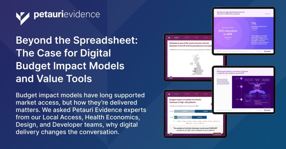
Discover our Digital Market Access Solutions
Some examples of our market access and payer communication tools are featured here: petauri.com/market-access-payer-communication-tools.
These include innovative solutions designed to help teams communicate value effectively and streamline market access activities, including:
- A full digital Payer Communication Toolkit (including value proposition and budget impact model)
- A new Value Proposition Slide Builder tool that offers a smarter way to build compliant, payer-ready presentations for approved content
- Our Global Value Platform, which centralises resources for multiple products and markets, giving affiliates the evidence they need to support access goals
For a full walkthrough of these demo tools and to explore how we can build bespoke options to support your market access goals, email evidence@petauri.com.
Share